Lately I’ve been referencing the classic Tufte book The Visual Display of Quantitative Information. I don’t agree with everything tufte has to say, but some of his advice is fantastic.
People who consume my results like bar charts, likely because they’re familiar from Excel. I’ve been working on some ggplot2 settings that generate beautiful barplots.
Here it is:
library(ggplot2)
library(viridisLite)
library(dplyr)

iris %>%
  group_by(Species) %>%
  summarize(mean.Sepal.Length = mean(Sepal.Length)) %>%
  ggplot(aes(x=Species, y=mean.Sepal.Length, fill=Species)) + geom_col() +
  theme(panel.background = element_rect(fill = NA),
  panel.ontop = TRUE
) + scale_x_discrete(breaks = NULL) + scale_fill_viridis_d()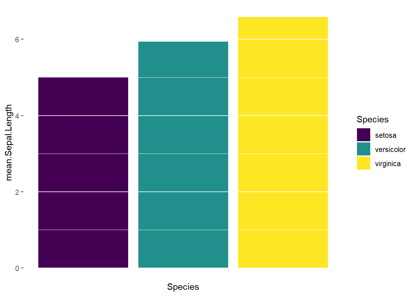
By unsetting the panel.background and adding the panel.ontop arguments in the theme, you get a very clean chart with white lines indicating the bar heights.
I also only recently learned about the geom_col geom in ggplot2 which is like geom_bar(stat="identity") but nicer looking :)